Role: UX Researcher, UI/UX Designer Duration: 10 weeks (Spring 2025) Team: May Phan, Tiffany (Yen-shi) Chen, Riley Nicholson, Z (Zhiyu) Ren Project Sponsor: Major U.S. Airline (Code-named Snowflake) *Snowflake is not a real airline company. This branding has been created to keep our project sponsor confidential.
Snowflake Airlines (code name) asked us to improve how travelers recover from disrupted flights. With upcoming cuts to customer service agent (CSA) staffing, the airline needed a cost-saving solution that could offload CSA workloads during irregular operations, or IROPs.Our team proposed several app enhancements — including group ticket linking, multi-channel rebooking notifications, and delightful interaction touches — to streamline recovery, reduce strain on CSAs, and improve traveler confidence.
My role: Co-leading digital prototyping, lead putting together final presentation.
Problem + Outcomes
How can we help make rebookings as simple as possible?
Problem: When a single flight is delayed or canceled, entire groups often scramble to rebook individually, even though they’re traveling together. This results in: - Confusion for travelers (especially groups unfamiliar with booking systems) - Duplicate labor for CSAs answering the same questions multiple times - Long rebooking lines and slower recovery for disrupted flights
Outcomes: We aimed to improve the passenger experience while saving time and costs for the airline by... - Enabling group ticket linking for faster, one-tap rebookings - Delivering real-time, multi-channel updates to reduce confusion - Adding reassuring design touches to support passengers emotionally during IROPs - Conducted over 12 interviews with CSAs and airline customers, prototyped 120+ screens - Conducted 2 round of usability testing with 8+ participants and iterated 3 rounds to create a business-focused final concept
Initial UX Research
Finding specific pain points for customer service agents and customers when delays happen.
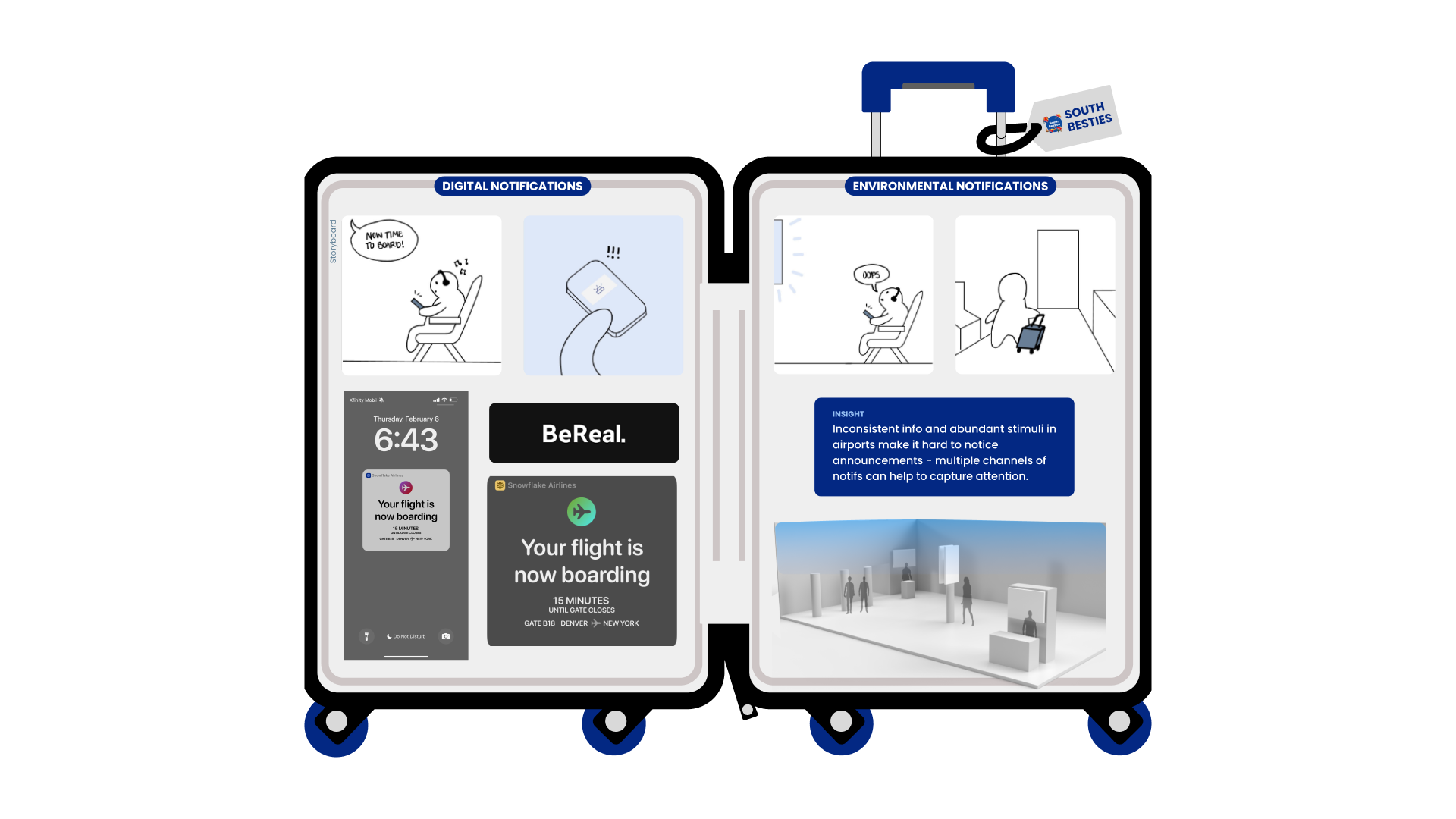
Primary Research: Our class traveled to Midway Airport in Chicago for an afternoon to interview traveling customers and service agents after conducting secondary research. Key insights included:
Initial Brainstorm, Insights, and Midterm: After synthesizing our research, we brainstormed 4 ideas surrounding our insights and presented to the Snowflake team at midterm. We received positive feedback on the ticket-linking idea, as well as on our experimental notifications idea.
Process Work
Brainstorming ways to streamline group travel, especially when delays happen.
Based on feedback from the midterm, we refined our focus:
How might we make it easier for families and people traveling in groups to have a better, more convenient gate experience?
A competitive analysis revealed that linking tickets after purchasing separately is a novel feature, leading us to pursue this as our focus while bringing Snowflake's mobile rebooking up to speed. This decision was supported by a 2023 Skyscanner survey stat: around 76% of leisure travelers to travel with at least one other person.
We rapidly prototyped and tested flows over 10 weeks, focusing on: - Mapping decision-making behavior during delays - Exploring ways to simplify group actions without violating data/privacy concerns - Prioritizing mobile-first accessibility for faster user recovery - Adding delight to increase brand loyalty
Personas to better frame our project.
To help narrow down our many ideas, we created a few different user journey flows within the app to map out where our ideas would fit on our personas' journey - a girls' trip to Denver.
An information flow for our linking feature on a flight with no delays.
Design
Iterating to improve ease and clarity when rebooking.
We designed a Group Linking flow that enables: - Group ticket linking during booking or post-purchase - One-click rebooking for the whole group - Personalized notifications based on group preferences and context
This interaction was tested and iterated with users, focusing on clarity, trust, and low-friction recovery. Our process was accelerated by working within a client-provided design system.
2 rounds of usability testing with a total of 8 friends and family members who often traveled revealed gaps in our concepts.
Lack of Onboarding For a feature as unfamiliar to users as linking, many interviewees had questions about what it was for and how to use it. To better introduce linking, we added a short tutorial.
Wait - how do I choose my seats? Although picking your seat is essential to buying tickets and rebooking, it flew over our radar. We added these flows in to make the experience more cohesive.
Chatbots? No thanks Interviewees noted that self-selection was quicker for rebooking and disliked chatbots in general. We replaced the chatbot with the ability to talk to a CSA online.
The app looks kind of stale Interviewees felt the app lacked visual friendliness. We added in additional illustrations to help flyers get the "Snowflake" experience, even with less CSA interactions.
We iterated to ensure functionality, a guided user experience, and customer delight, better aligning with our design goals. Below are the main flows after iteration.
Onboarding to introduce linking to users.
Learnings + Next Steps
Presenting around a specific user's journey to introduce concepts with empathy.
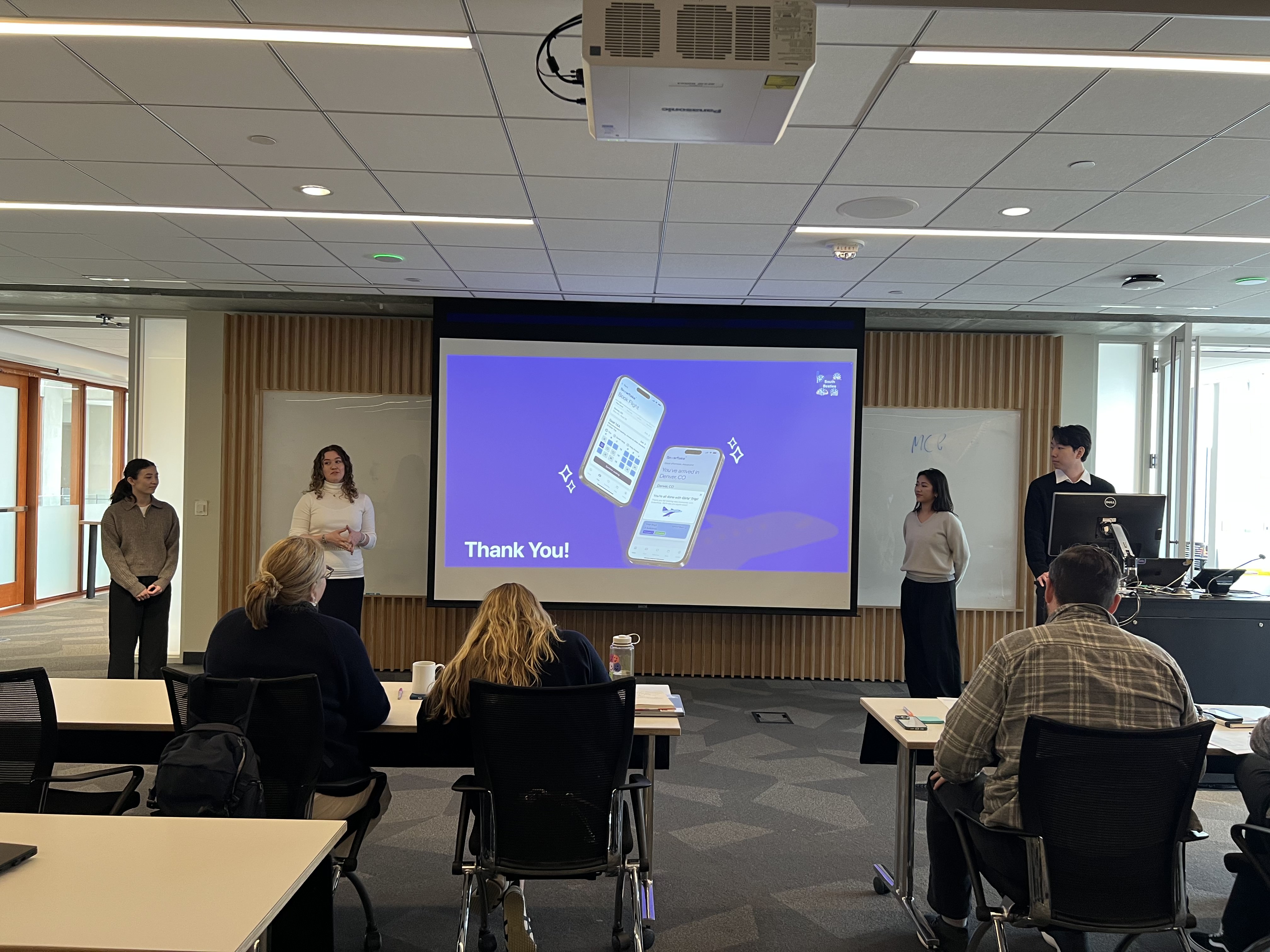
Presenting our final by focusing on our personas' Girls' Trip to Denver kept us clear and focused. Framing the project through both user needs and business value helped us make a stronger case to our professors and client sponsors.
We quantified potential impact by showing how group rebooking could: - Save time for CSAs - Reduce help desk traffic - Align with the airline’s operational goals to cut support costs without sacrificing customer experience
.svg)

.svg)
.svg)
.svg)
.png)


.svg)
.svg)


%20(1).gif)
%20(1).gif)
.gif)
.gif)
.gif)

.gif)
.gif)
.gif)